The importance of website wireframes
Why we use wireframes and why they’re important
Here at Inventive, we like to make the design process as easy for you as possible, especially when it comes to the jargon-filled, headache inducing world of website design and development. It’s also our job to make sure that you and your clients find your new site intuitive and easy to navigate, something that the industry likes to call User Experience Design (or UX) which pretty much defines the ergonomics of the digital world.
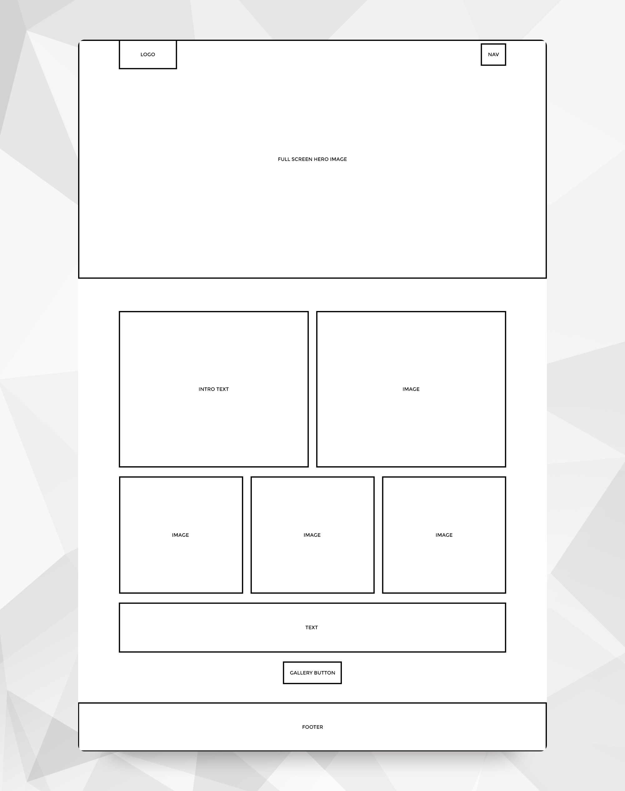
Nowadays, a designer will often use wireframe design as an important step to define the hierarchy of information, a step that is relatively quick to complete and very easy to adjust or amend. This stage informs the layout of the website only, and does not feature any design features whatsoever. It is probably best to think of a wireframe as the blueprint or skeleton of your website, showing only the bare bones of the structure. The complete lack of visual ‘design’ in a wireframe actually helps the designer and client make more informed decisions about the placement of information without the distraction of images, colours or typography that might otherwise mask bad design choices.
How to design a wireframe
The first stage of any design process is pretty much always research. Finding out who the competitors are and how their websites are successful or unsuccessful can inform a designer of the best steps to take on the new design. It is also worth looking at existing websites as if they were wireframes, ignoring the images, colours and other content, instead focusing on the positioning and organisation of the content and how effective this is, as well as how user friendly.

Throughout this first stage, a designer may sketch physical rough versions of wireframes. These quick diagrams will usually help work out the rough placement of elements, or just the organisation and division of screen-space. As a client you will probably never see these rough ideas, unless you complete this stage yourself.
From idea generation, site-mapping and rough sketches, a designer can build a true wireframe. This design will often be the classic black-outline boxes and black captions, describing what each element is, with very little in the way of content or contrasting elements. Whilst this stage may also be done on paper, I find it more helpful to design a wireframe in the same way and using the same software I will be using to complete the full website design later. This means that spacing, placement and width of the wireframes can be taken directly over to the full design.

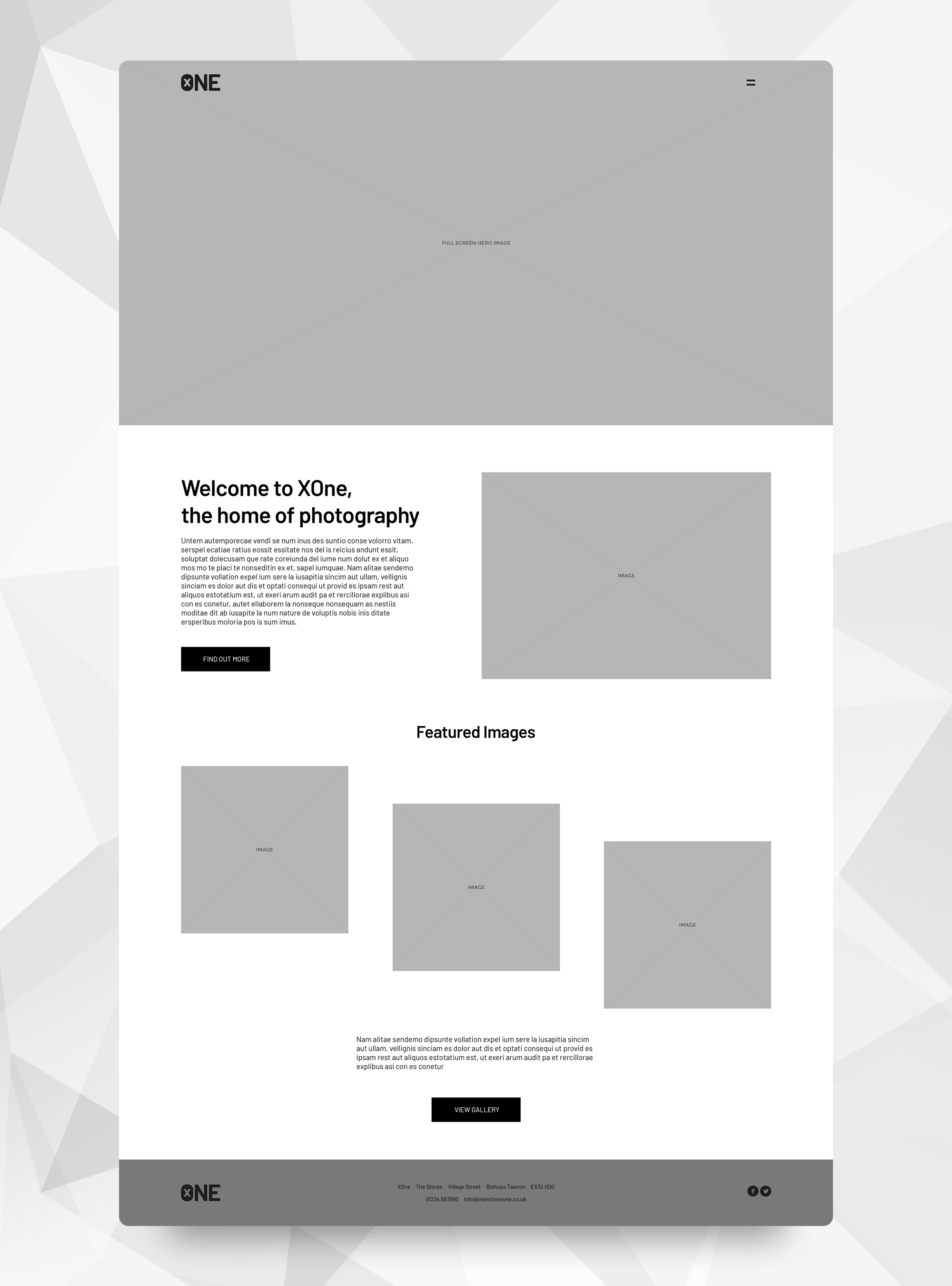
I tend to skip a stage at this point by defining text areas and headers with basic placeholder text, which I find helps the client to bridge the gap between a seemingly random assortment of boxes, and a full-blown page design. At this step I will often use the client's logo (always in greyscale so as not to distract from the layout design) as well as different shades of grey boxes to describe elements such as images, navigation or buttons. Once again, experience has shown me that these minor ‘design’ elements are more easily understood than basic outlined boxes. This type of wireframe is sometimes referred to as a Hi-Definition Wireframe, due to it appearing closer to the final design of the website. These wireframes are often slightly more adventurous with the layout of content, including more stylised design elements than would appear in the basic wireframes.

Why wireframes?
The beauty of wireframes, as mentioned before, is that elements can be rearranged, resized or removed easily, without having to worry too much about how this is going to affect the content of surrounding elements. This helps save time in the design and development phases, where layout amends are much harder and more time consuming to make. Wireframe design is also an important and helpful factor in completing mobile-first design projects as elements can be quickly copied or duplicated onto the desktop version. A side-by-side comparison of mobile and desktop wireframes can also help designers and clients understand how elements will stack, change or disappear when scaling down to smaller devices.
Wireframes are an incredibly useful and powerful tool for designers to use when structuring a website, but they also work well to describe a potential layout to a client. Whilst some may be worried that they don’t understand the mass of boxes, or would prefer to see their content in the design, it is worth remembering that wireframes can help eliminate bad design and create a more user friendly experience by ignoring distractions such as images, colours and finalised typography. If you’d like to find out more, or if you have a web design project you’d like us to take a look at, feel free to get in contact with us.
