
Responsive Branding for Responsive Websites
The Future of Logo Design
You may have read my recent blog about responsive web design where I talked about the virtues of designing websites in a ‘mobile-first’ approach. If not, feel free to go back and read it now - I might be covering some of the same ground here but in a slightly different context. The main point of this blog is to talk about the future of logo design how this relates to responsive website design; responsive logo design.
Wait…responsive logos? Yeah, you read that correctly. Before we jump right into it, though, a bit of catch up. Traditionally, a logo was a single static aspect of your branding that would be in one or maybe two forms, such as single colour for news print, but that was it. This makes sense - you don’t want a bunch of different looking logos for one business as this would obliterate any idea of a brand recognition with your customers. This was the case predominantly in the era when print was king and web was somewhere in its infancy. Today, web shares an equal, if not stronger, footing than print in the mainstream information offering. You might still buy a magazine or newspaper but, lets be honest, most people will check the web for a quick update on daily events.
So, the big bad web has come along and ruined the party for logo design?
Well, yes and no. For a start, the way we consume a digital product is quite different to its print counterpart which means that the way they’re designed is also very different. This also applies to the content that features, such as the amount of text on display, the layout of images and the logo. Now, before I get much further, I just want to clarify; I am not talking so much about the web on desktop, rather its mobile counterpart. How this affects design is much more drastic as, obviously, the lack of screen real-estate in comparison to desktop means that information has to be brutally streamlined so that it is easily accessible and consumable by the viewer.
With mobile browsing now accounting for more than 60% of web traffic, as well as the huge popularity of mobile apps that all but replace the original website, the way logos need to appear has had to change. Interestingly this has, for the most part, only changed the way we view logos on these devices.
Enter the responsive logo
A responsive logo is something that adapts to the size it is viewed at or device it is viewed on, much like a responsive website. Resizing a logo does not make it responsive. Whilst a large, complex and wordy logo is fine for print work and desktop sites, it would probably be illegible at the small size allowed on a mobile site. The responsive logo combats this by stripping down the logo so that it is much more simple but still recognisable as the same company as the original. Coca-Cola, Disney, Heineken and Guinness have all adopted responsive logos so that their brands register well on any device. To see responsive logos in action check out this clever tool.
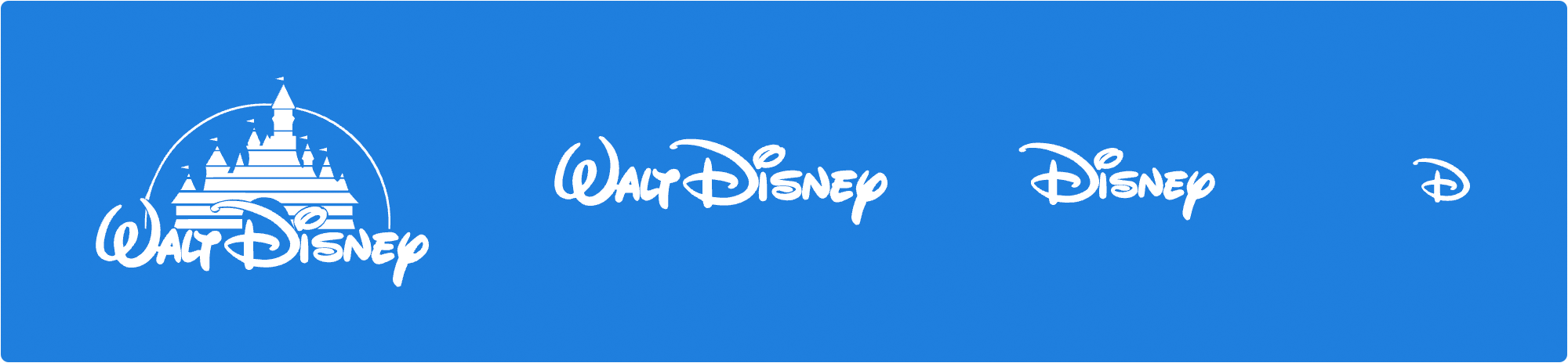
In the case of Disney, the full logo with ‘Walt Disney’ and the Disney castle is slowly distilled until only the ‘D’ of Disney remains. It’s still instantly recognisable, we all know what company it belongs to and what it means, but it is much more mobile friendly and can be used as a replacement for the main logo, an app icon or the favicon that appears in the tab at the top of your web browser.
Icons have been around for ages, so is this really new?
Whilst simple icons, or logomarks, have been around since the year dot, a responsive logo deals with more than 2 steps; you don’t just have a main logo and a mobile version, instead you get three or more steps as the logo gradually simplifies in order to suit a wide range of possible uses until only the logomark remains.
Some companies have no need for responsive logos as, over time, their branding has naturally simplified whilst also staying instantly recognisable. Think of Apple and Ford: these two brands are iconic, quite literally, and instantly recognisable and incredibly simple. There is no need to simplify these logos down further as they are already at that point. Apple has actually done away with any sort of logotype, the typographic part of any logo, and simply relies on its logomark; people know what it is and what it means without this, possibly due to a ‘say what you see’ logo design. These are very unique exceptions, however, and are due mostly to the global popularity and familiarity of the branding as a whole.
As a designer, I would say that designing a logo to be responsive is as important as the colours or typography used. It might seem like you now have a lot of different logos for your business but try to think of it instead as one logo with several variations that allow your brand to remain recognisable even on the smallest devices. Whilst this trend was born from the boom in mobile-first web design, it can work brilliantly across any media, digital or print. We work alongside our customers when implementing this type of logo within their branding; producing helpful guidelines to outline exactly how a logo should look no matter what the size. Get in contact with us if you have a branding project; we’d love to help!